Lung cancer incidence, treatment and survivability
Data Visualization
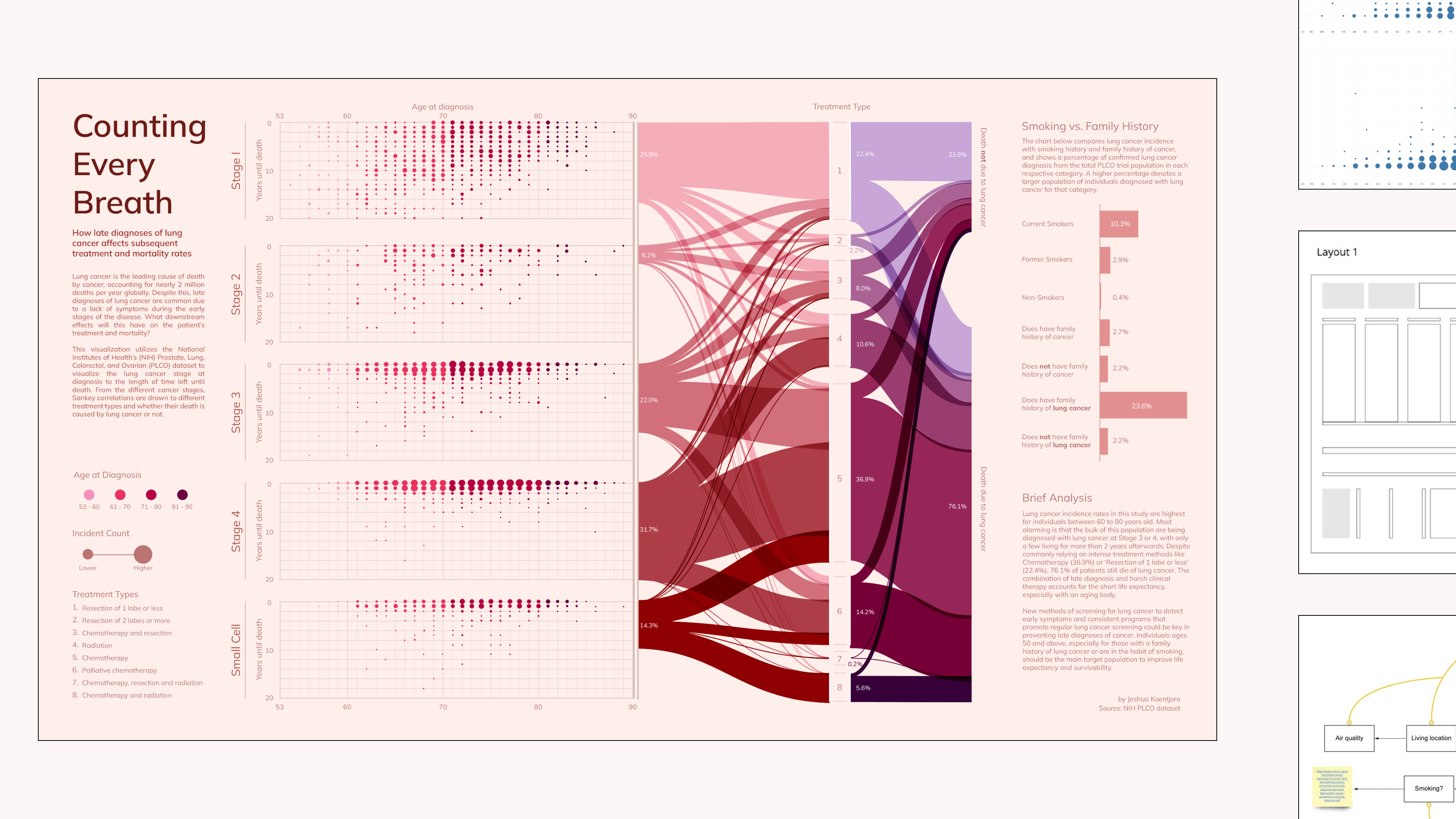
Counting Every Breath
Lung cancer incidence, treatment and survivability
Data Visualization
Challenge:
Showing the continuity of statistical correlation between stage of cancer at the time of diagnosis and how subsequent treatments affect survivability.
Solution:
Using the NIH's dataset, the design of the visualization combines a dot plot with an alluvial chart. This allows the reader to follow each population subset as they are diagnosed to their resulting clinical outcome.
Tools
Miro, Tableau, Rawgraphs, Adobe Illustrator
Client
Prof. Jodie Jenkinson (MSC2023H)
Target Audience
Healthcare workers, policy-makers, families with aging individuals.
Challenge:
Showing the continuity of statistical correlation between stage of cancer at the time of diagnosis and how subsequent treatments affect survivability.
Solution:
Using the NIH's dataset, the design of the visualization combines a dot plot with an alluvial chart. This allows the reader to follow each population subset as they are diagnosed to their resulting clinical outcome.
Tools
Tableau, Rawgraphs, Adobe Illustrator
Client
Prof. Jodie Jenkinson (MSC2023H)
Target Audience
Healthcare workers, policy-makers, families with aging individuals.
Process
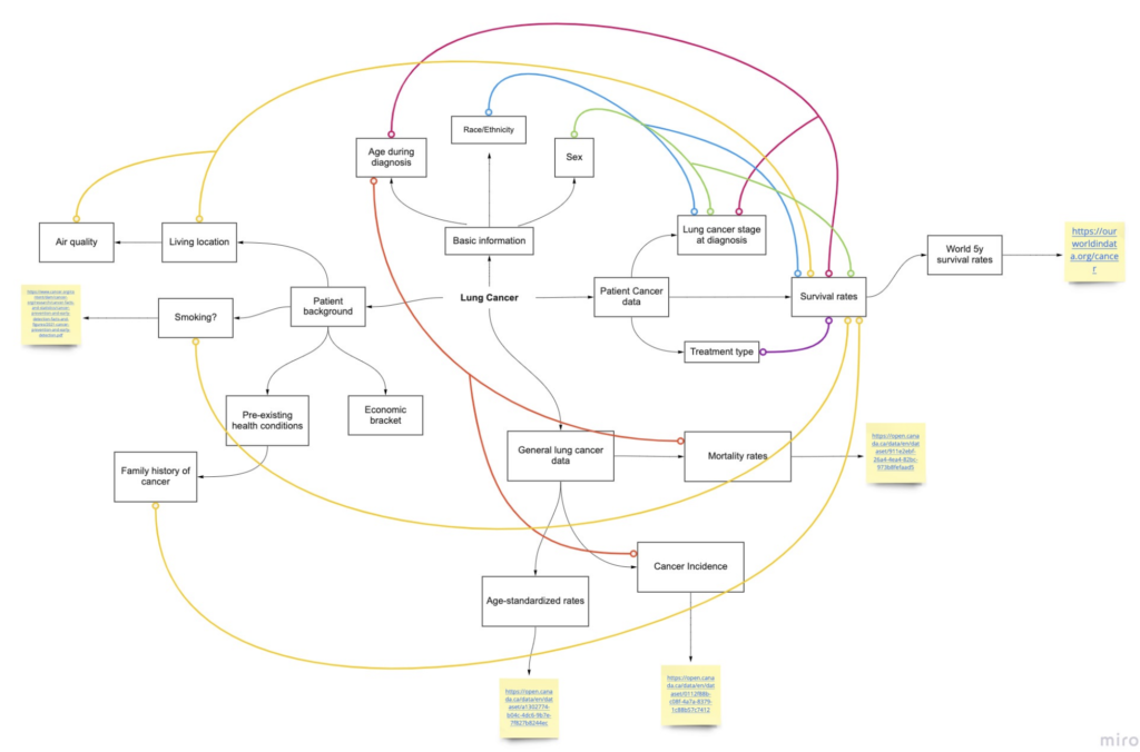
Ideation
Lung cancer, as you can imagine, is a very complicated sickness with complex contributors and indicators. To begin, a word map was created to gather and connect ideas that are refined within rough sketches. The success here is using a familiar narrative of diagnosis to death and using different dot plot bins to separate each cancer stage. Check out my visual inspirations here.
Data Cleaning and Asset Creation
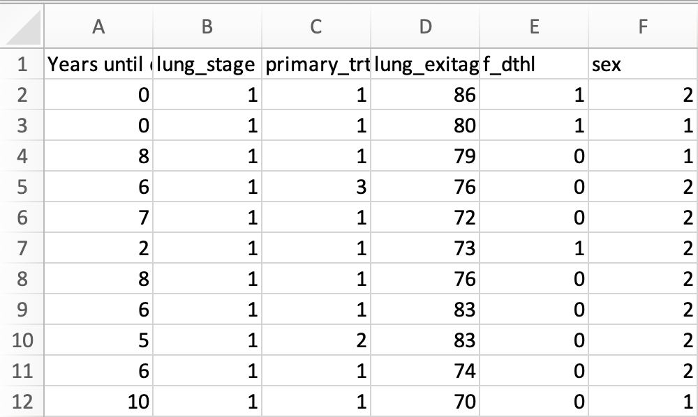
NIH’s Prostate, Lung, Colorectal and Ovarian (PLCO) Cancer Screening Trial dataset was used in this visualization. The data was first organized using Excel and then refined further through Tableau.
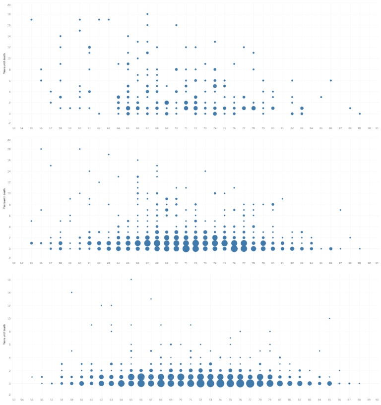
Graphs were created using Tableau or Rawgraphs and exported to Adobe Illustrator for further edits.
Data Cleaning
NIH’s Prostate, Lung, Colorectal and Ovarian (PLCO) Cancer Screening Trial dataset was used in this visualization. The data was first organized using Excel and then refined further through Tableau.