Is this my stop?: Redesigning the wayfinding systems of Vancouver's Canada Line through a rider-centered lens
[Case study]
How might the Canada Line be improved so that riders can intuitively navigate the transit service?
Challenge
Solution
Challenge
The Canada Line currently lacks the necessary quality-of-life design updates in its wayfinding devices that’s needed for riders to comfortably navigate their way through the system.
Solution
Design updates or additions to station and in-train signs, displays, and markers so that riders can consistently know where to go within the system during their journey.
The Canada Line currently lacks the necessary quality-of-life design updates in its wayfinding devices that’s needed for riders to comfortably navigate their way through the system.
Design updates or additions to station and in-train signs, displays, and markers so that riders can consistently know where to go within the system during their journey.
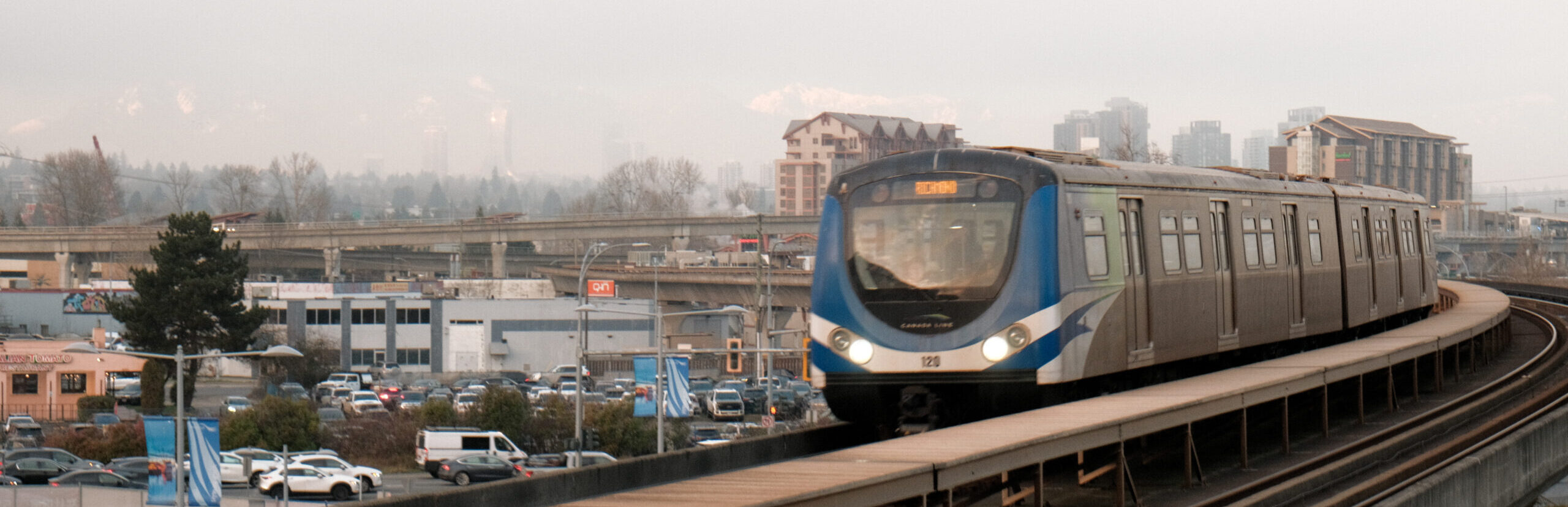
The Canada Line is a train transit service that shuttles riders between the terminal stations of Downtown Vancouver, Richmond and the YVR airport.
The construction for the transit system finished in 2009, in time for the 2010 Vancouver Olympics. Since then, the Canada Line operates 2-car trains running between 9 above-ground stations and 8 subway stations every 3-15 minutes, with frequencies fluctuating based on the time of day. A typical station has a simple layout that directs riders unidirectionally between the entryway to the fare gates, and onto the platform.
The trains have a capacity of around 342 passengers with accessibility-specific and multipurpose spaces built in each car that could fit bicycles or other large rider wheeled items (e.g., strollers, luggages, etc.). Within the train, there are LED signs at both ends of each car that scroll information about the next station and terminus station horizontally. Above the doors of the cars are backlit acrylic maps that show the Canada Line stations.
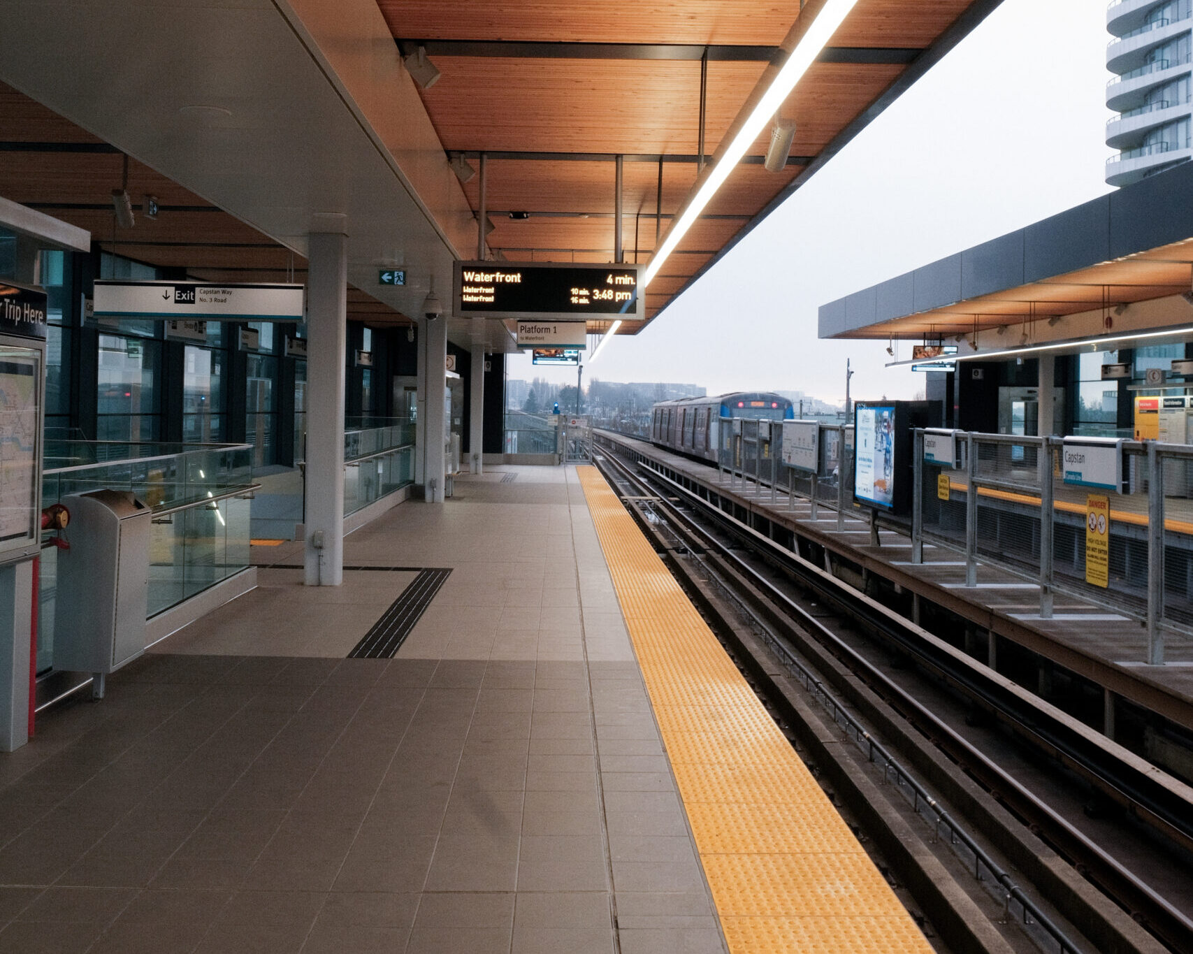
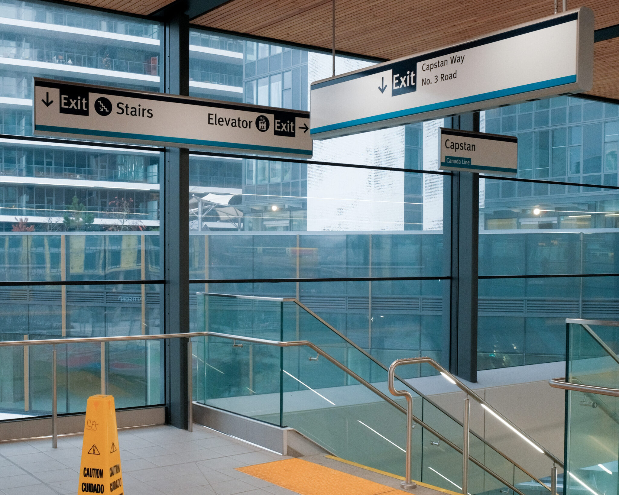
Canada Line train arriving at Capstan station
The wayfinding devices in the transit system remain largely unchanged since 2009 despite riders' frustrations with them.
The Canada Line currently lacks the necessary quality-of-life design updates needed for even the most seasoned rider to comfortably navigate their way through the system, especially when compared to other metropolitan cities’ transit systems.
Running through the high-density areas of the Greater Vancouver Area (GVA) – the third-largest metropolitan area in Canada, the Canada Line carries an average of 132,000 riders during weekdays and 189,000 riders during the weekends (1). That’s about 10% of all transit trips taken in the GVA!
Improving the design of Canada Line services so that it is more intuitive, and easy for riders to navigate can increase the satisfaction of current riders and attract prospective riders who might’ve chosen to drive elsewhere instead – without significant investments or changes to the infrastructure. The resulting induced demand from better service may improve other areas of transportation infrastructure and mobility – which is an increasing problem in the GVA.
Research & scope
Research for this case study was done through a combination of qualitative research through interviews with four Canada Line riders as well as literature research to fill in knowledge gaps. Although there are many qualities that make up a rider’s experience using a transit system, this case study will only focus on aspects related to wayfinding design. The recommendations will focus on solutions that are logistically viable, economically feasible, and easily implemented using Robert Mace’s Principles of Universal Design as frameworks (2):
Simplicity (eliminating unnecessary complexity)
Perceptibility (presenting different modes of redundant information).
This case study aims to:
Highlight the service design pain points on the Canada Line related to wayfinding design
Provide design recommendations based on primary and secondary research that can address these gaps
Rider pain points and design recommendations
The following section will be divided into four key parts of a rider’s journey using the Canada Line:
Entering the station
Waiting at the platform
On the train
Exiting the station
A) Entering the station
As soon as they are near the station, riders need to know when the next train is coming and where to go to catch the train, but…
As soon as they are near the station, riders need to know when the next train is coming and where to go to catch the train, but…
Pain point
There are no ways for riders to know when the next train is coming until they are in the platform, often frustrating riders when they have just missed their train.
Design recommendation
1. Install an information display at the entrance of every station that shows incoming riders real-time information when trains are arriving next.
Similar to the platform displays, it should show the next few trains that are arriving at the station, which platform they’ll be arriving at, and the time remaining until their arrival.
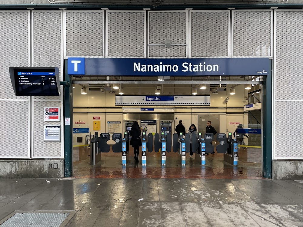
Nanaimo station on the Expo Line has entrance displays that show incoming riders when the next train is coming. Translink can use the same hardware for Canada Line stations.
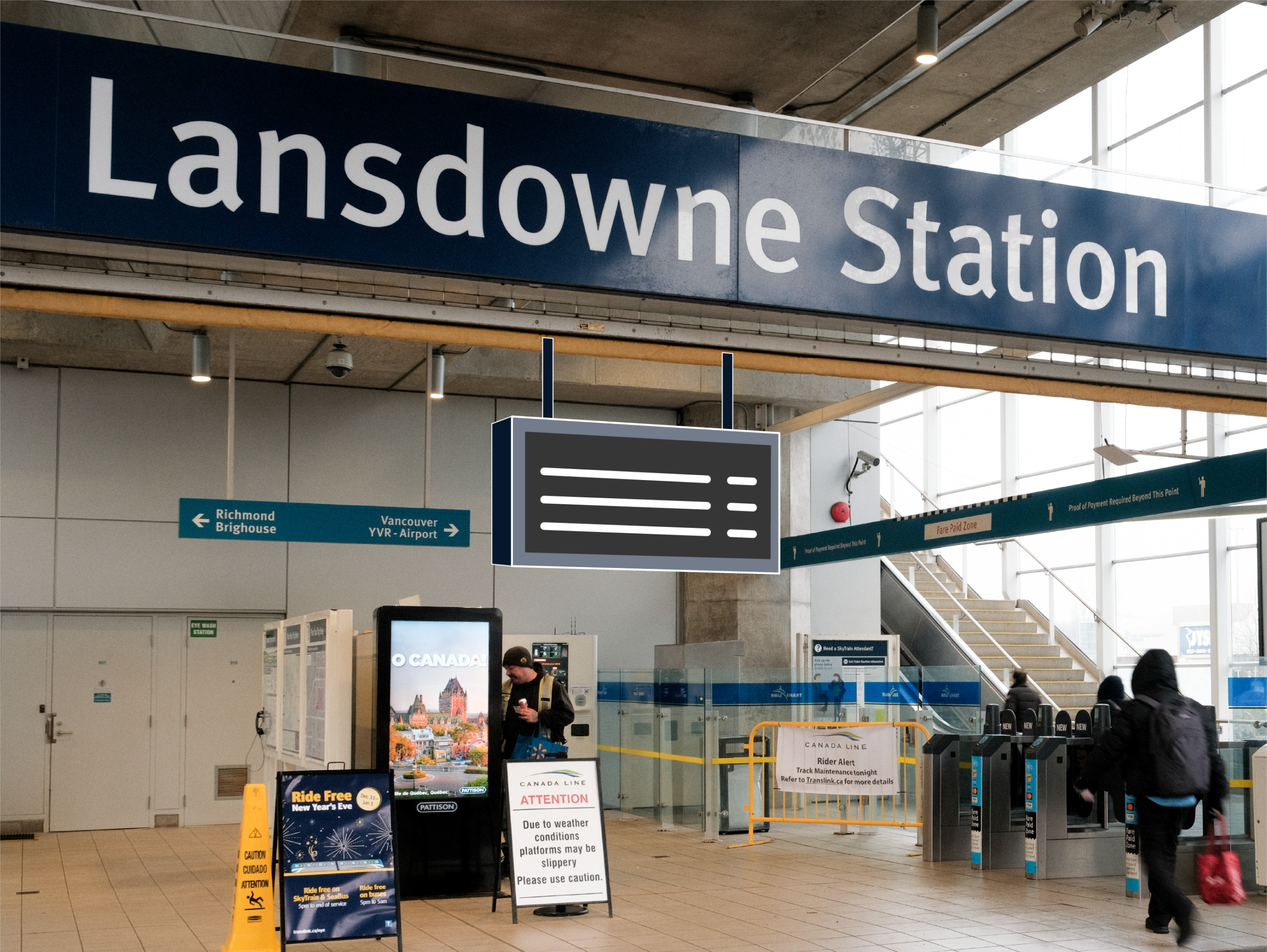
A mockup of what an entrance display could look like at Lansdowne station
Impact:
Riders will know, even before they enter the station, when their next train is coming so that they can gauge their urgency to catch the next train
Impact:
Riders will know, even before they enter the station, when their next train is coming so that they can gauge their urgency to catch the next train
B) Waiting on the platform
Riders need to know which platform their train will arrive in and prepare to board the train by standing at designated areas, but…
Riders need to know which platform their train will arrive in and prepare to board the train by standing at designated areas, but…
Pain points
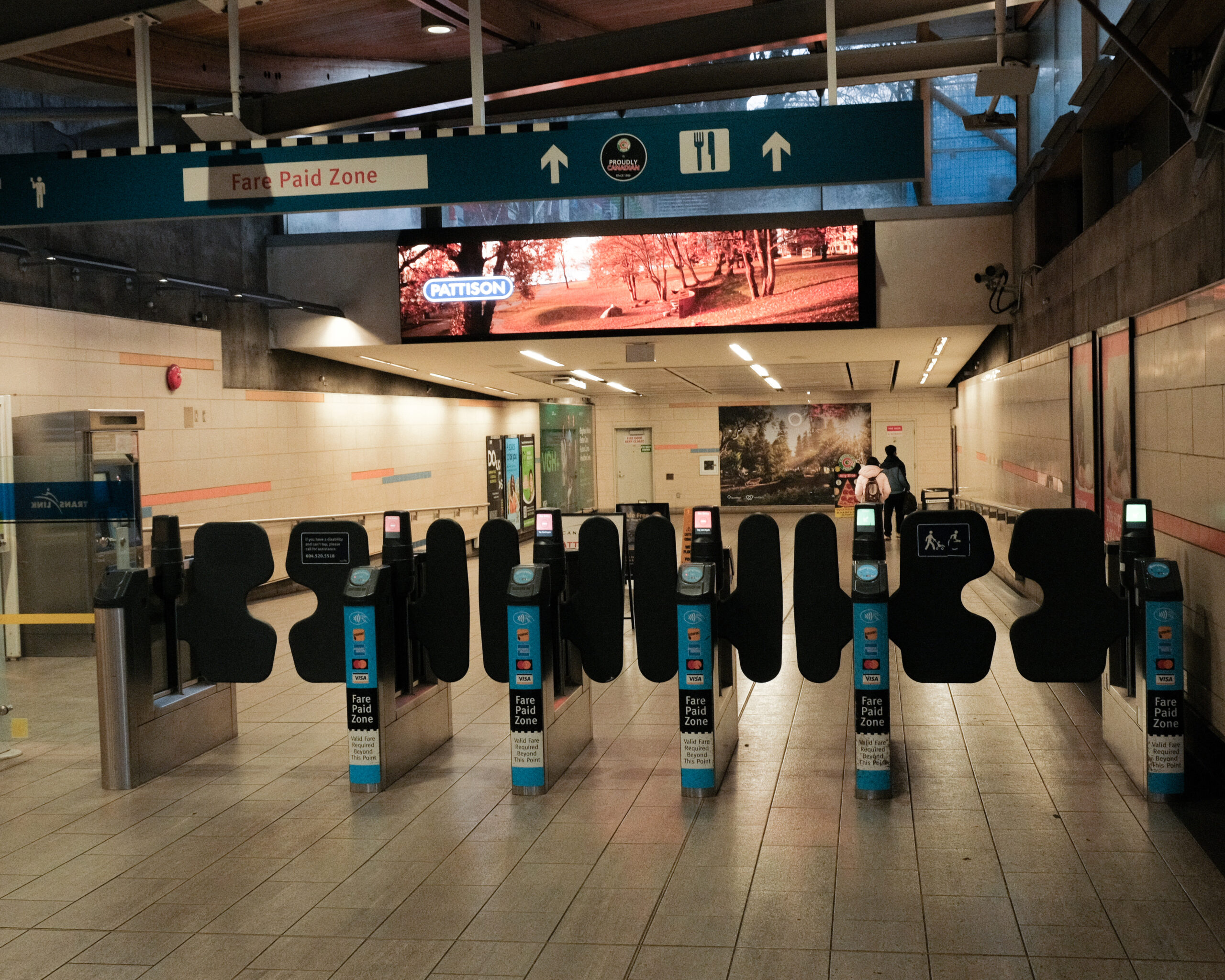
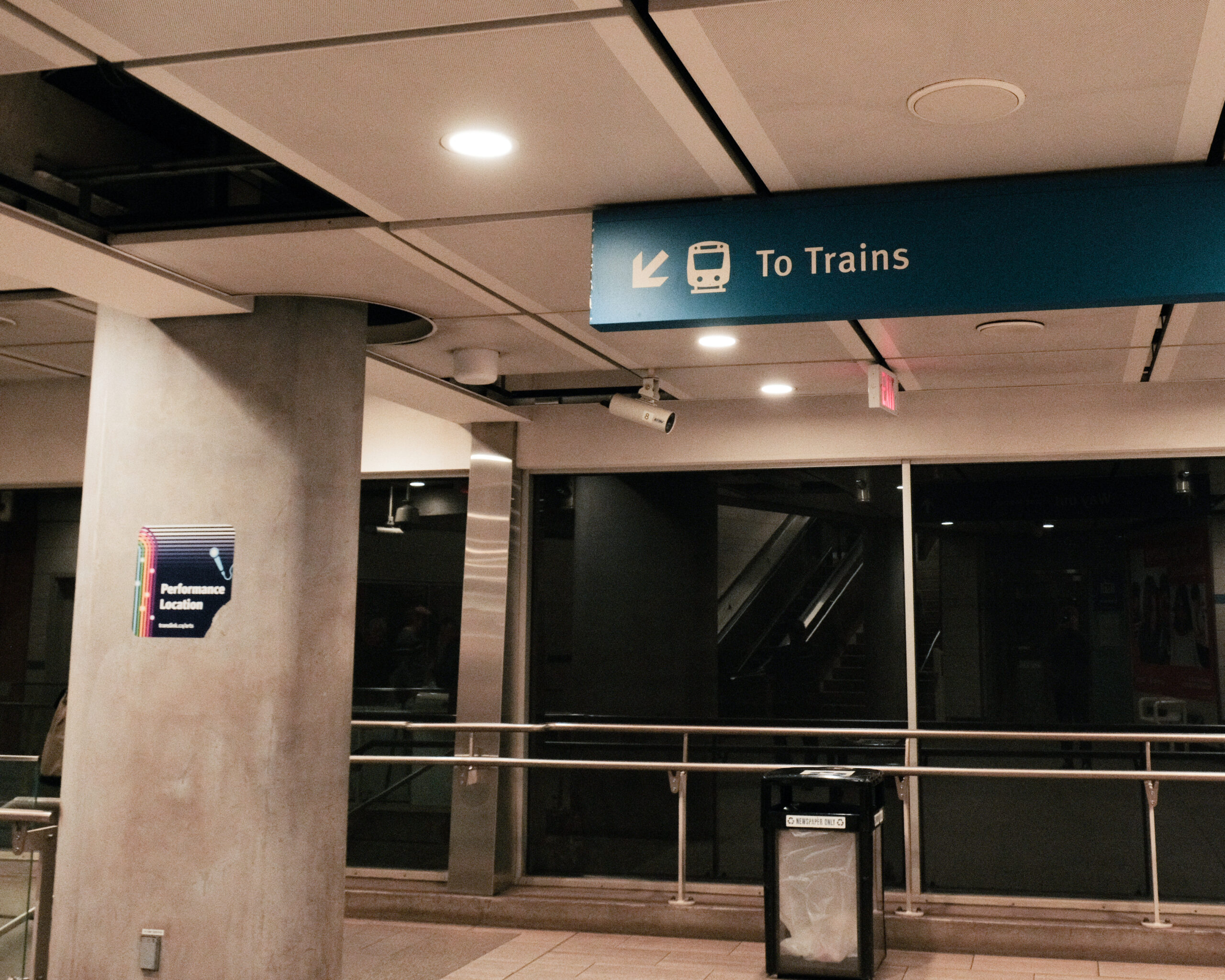
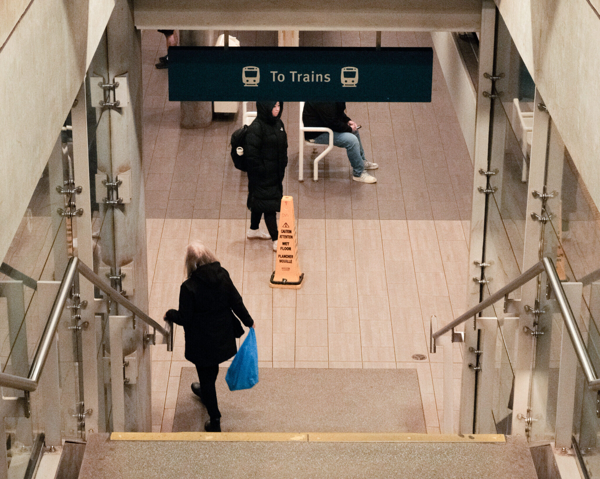
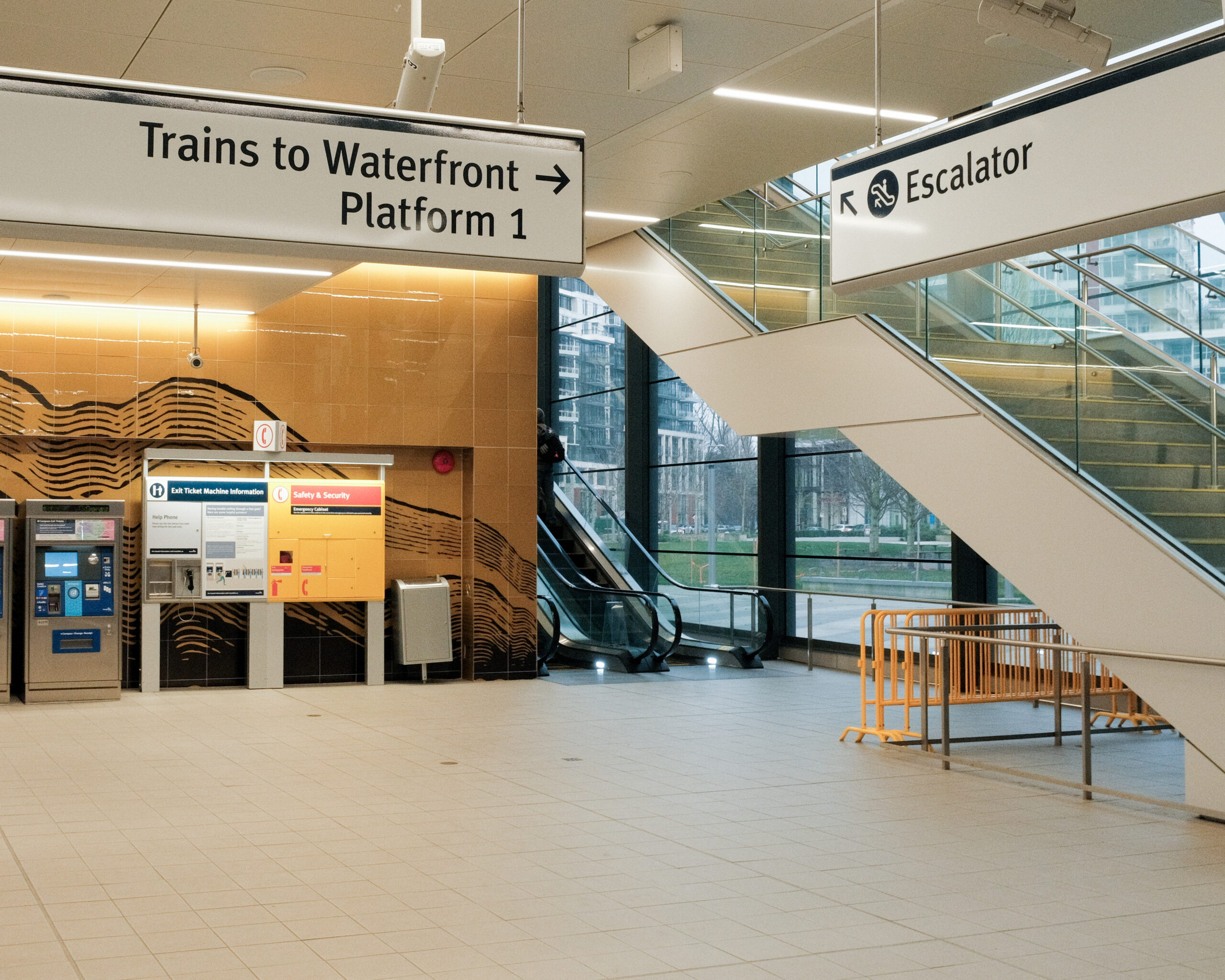
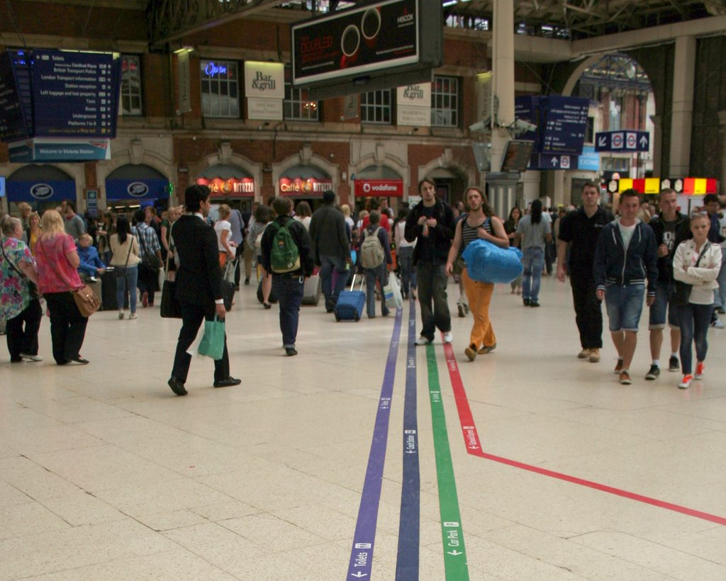
There is a lack of consistent directional signage and overall guidance for riders to let them know which platform to wait at for their train. Most stations use vague ‘To Trains’ signage (see images 1-3 on the right). Announcements can add to the confusion by using direction-specific words such as ‘inbound’ or ‘outbound’ that might not be intuitive for riders.
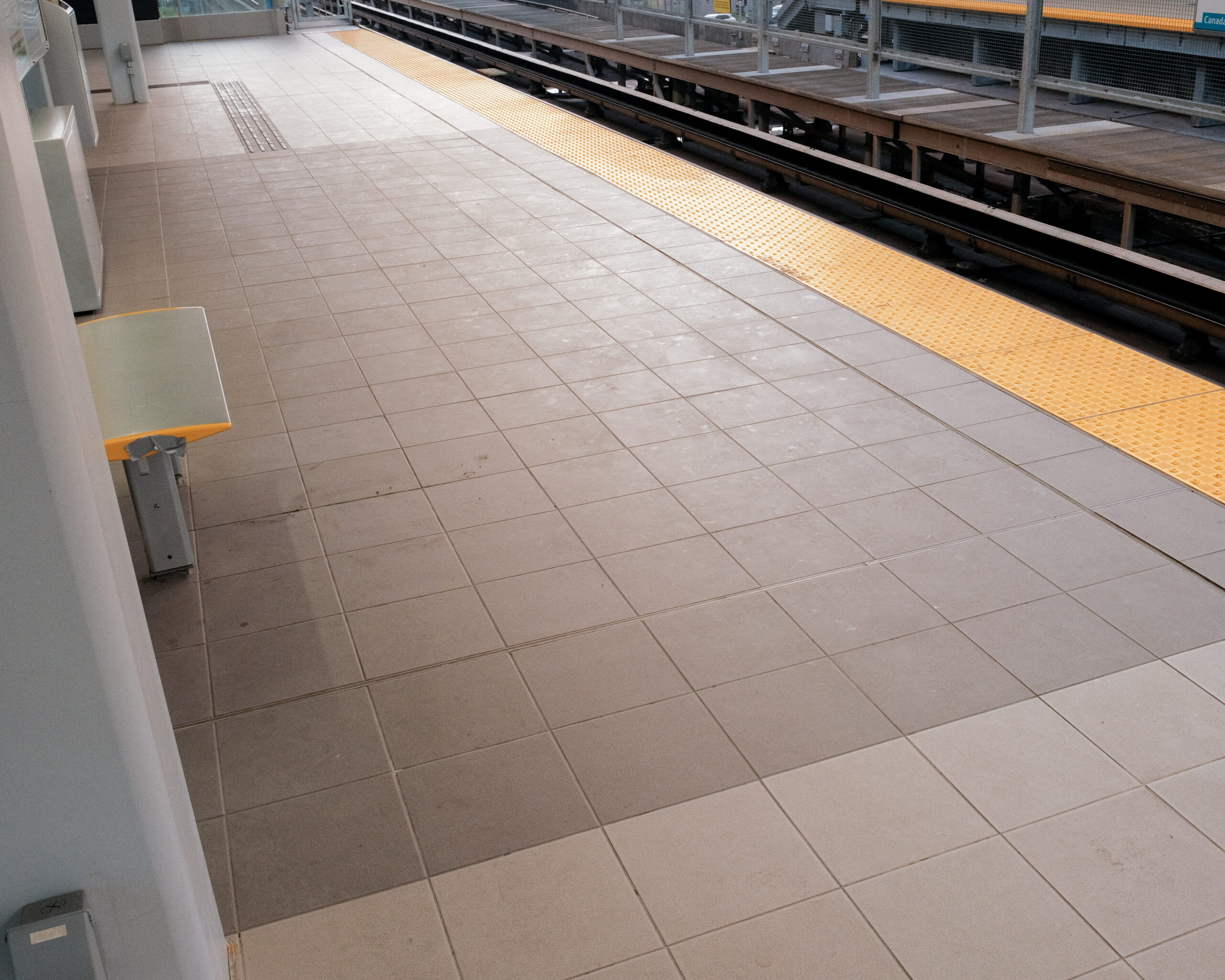
There are no indicators for riders to know where the doors of the train or designated car areas are on the platform, inducing crowding and jostling for riders entering the train cars – especially for riders with accessibility needs, bicycles, and those carrying large items (see image 4-5 on the right).
The lack of orderly ingress results in riders clumping at the front of the car doors as the trains arrive, making it difficult for those inside to exit.
Entrance of station
Signage before escalator to platform
Sign prior to platform
Platform floor that has minimal markings
Tiled floors of platform floor
Previous
Next
Design recommendations
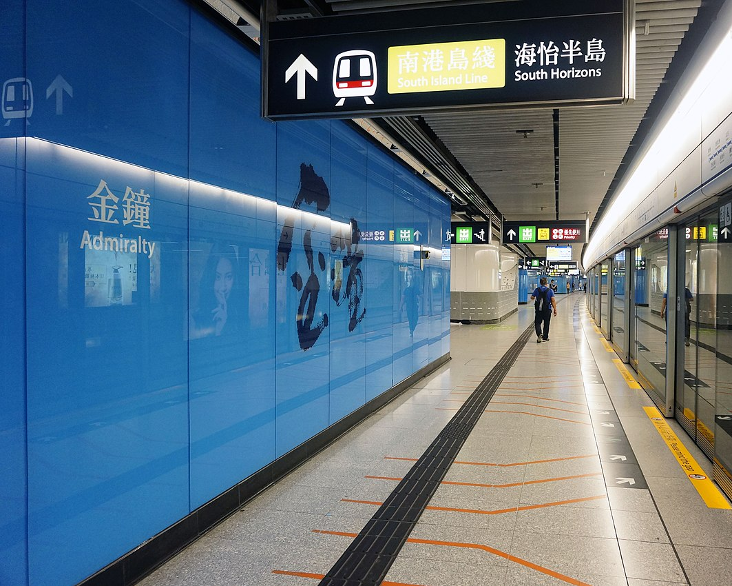
2. Install explicit directional signage at key spots along the station’s journey lanes to consistently indicate to riders where to go to board a specific train
The signs should be installed right after the station entrance gates and at any point where there is a level change (e.g., stairs, elevators, escalators) (see photos 6-7 below).
The signs should also state clearly the directions of the trains and which platform to wait at (e.g., ‘Trains to Waterfront at Platform 1’).
3. Correlate the audio announcements for incoming trains with a key corresponding to a platform number.
The information in the announcement should contain information about:
The terminus station of the next train
Which platform it will be stopping at
E.g., “The next train going to Waterfront station is arriving at platform one“
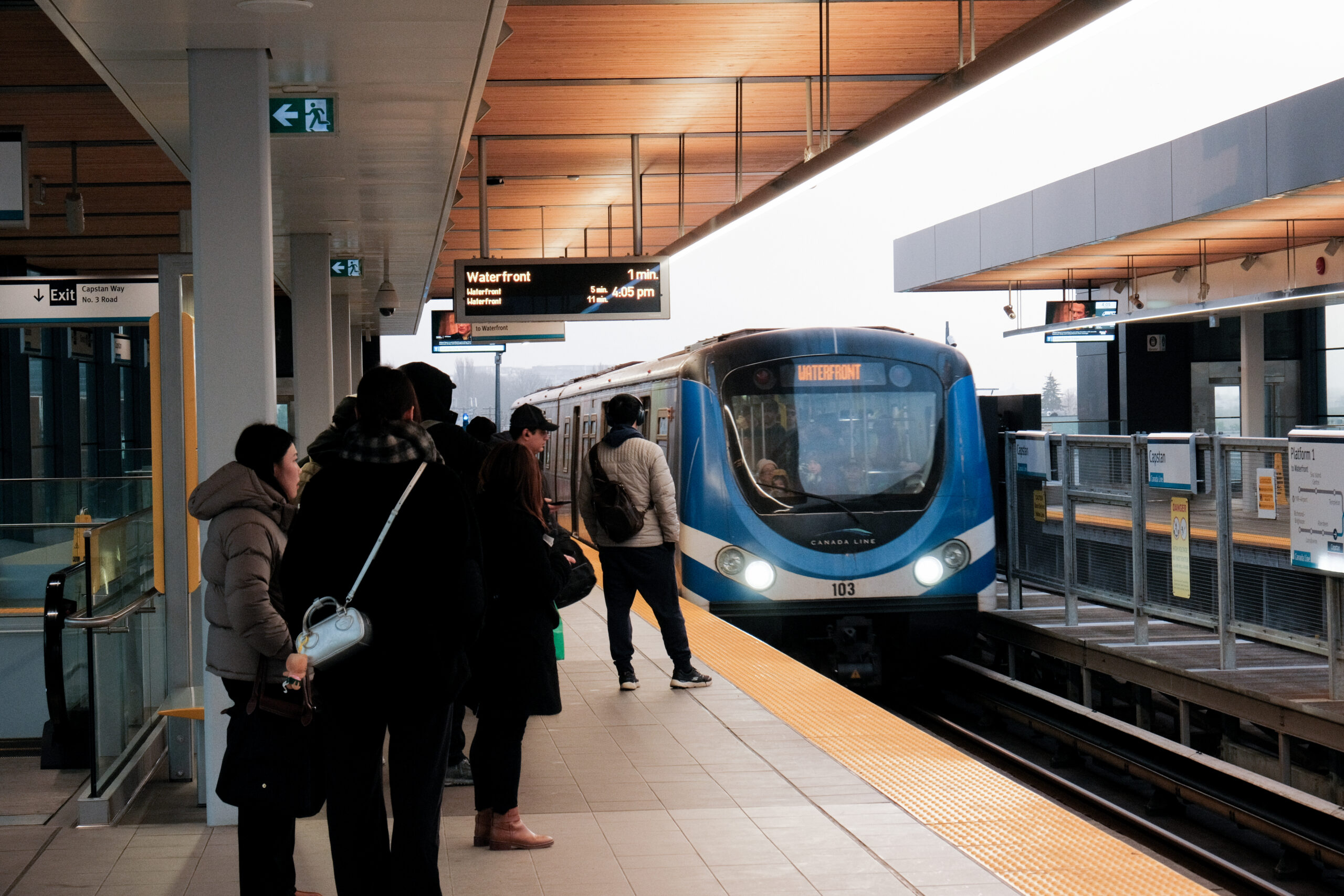
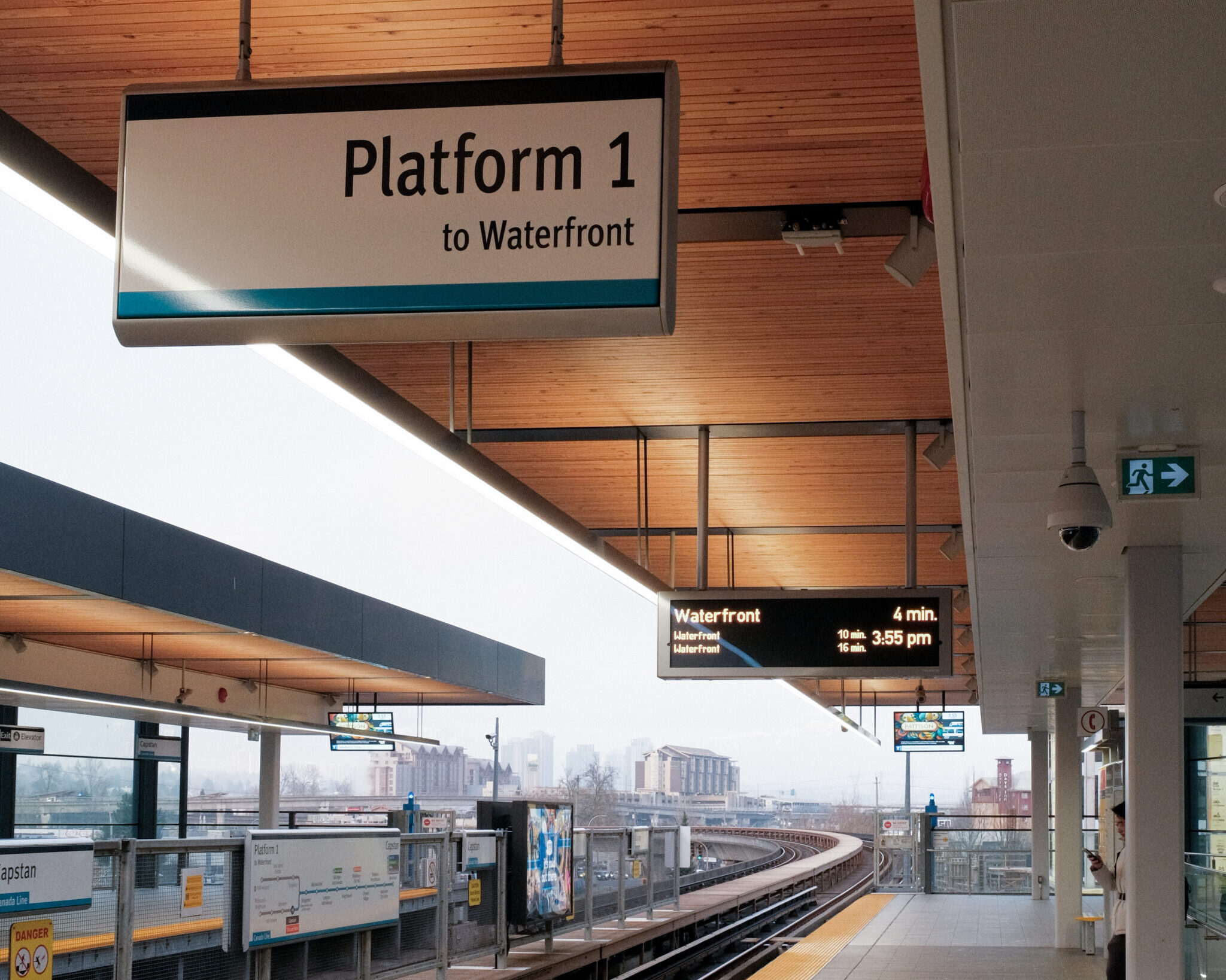
At the new Capstan station, signage that guides riders to platforms are more clear than other stations
Platforms are numbered at Capstan station, giving riders a way to identify which platform is which
Impact of 2 & 3:
Riders will have a consistent guide for where to go in the station and which platform wait at so that it minimizes any confusion about which train to take.
Impact of 2 & 3:
Riders will have a consistent guide for where to go in the station and which platform wait at so that it minimizes any confusion about which train to take.
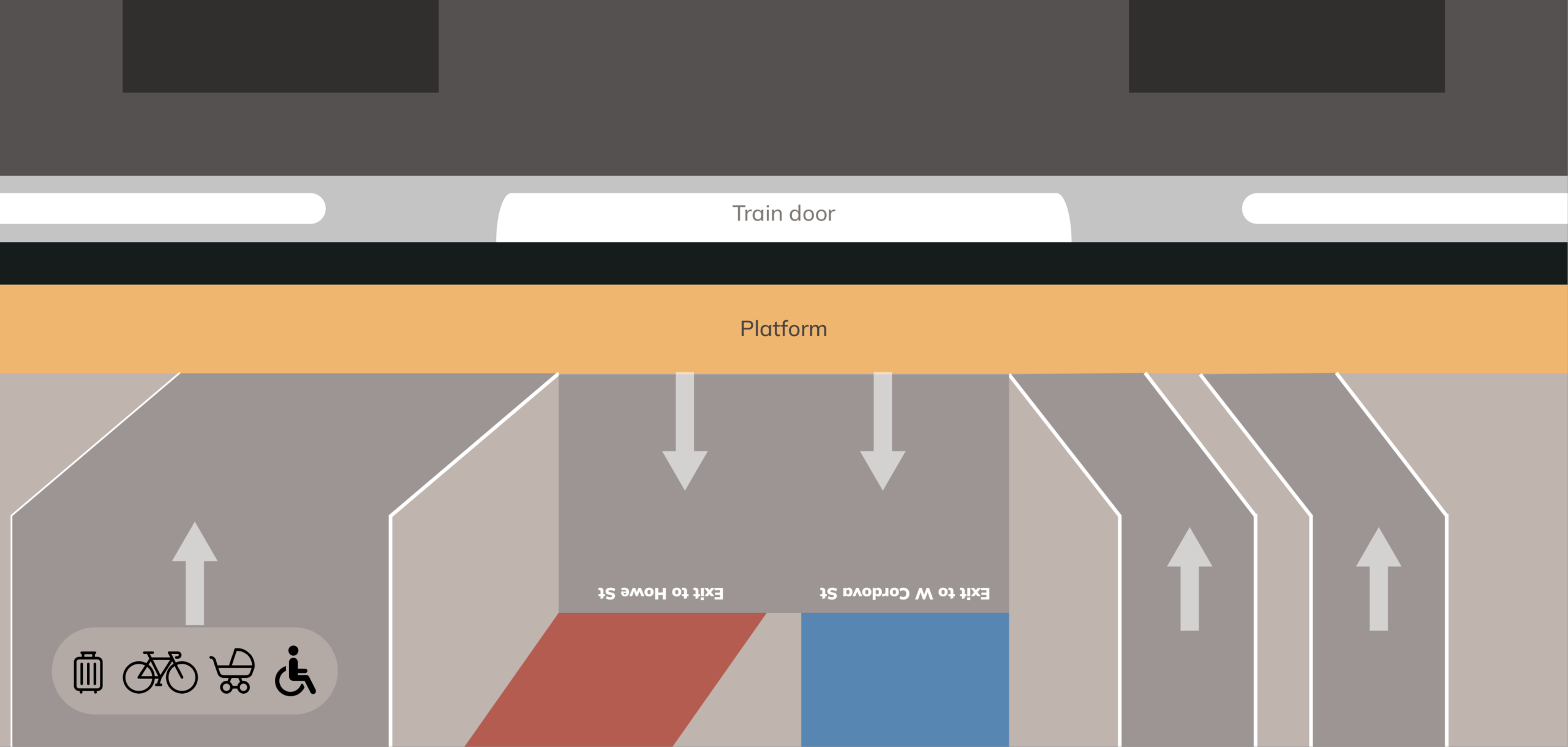
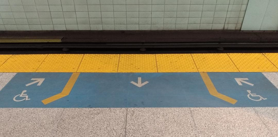
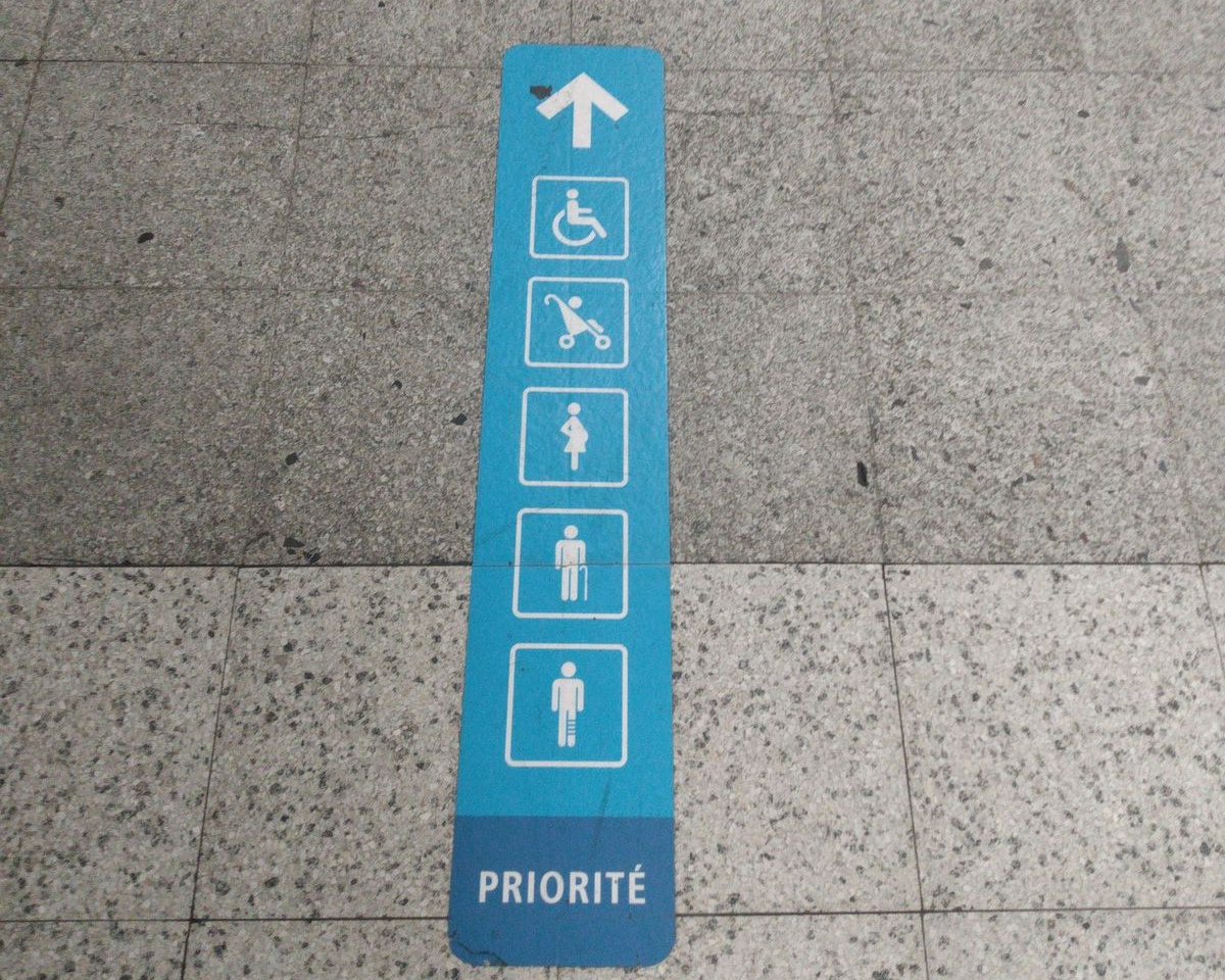
4. Create visual markings on the station and platform floor that will indicate key spaces and destinations to follow
Floor markings can include:
Colored lanes that provide riders with a path to follow towards an entrance, elevator, exit, or platform
Platform sections that designate waiting areas and spaces for the train doors can reduce dwell times by reducing platform crowding
Floor markers that indicate to riders important or priority areas on the train (e.g., bike and accessibility spaces)
A mockup of what platform station markers could look like at Waterfront Station. An exit area is placed directly in front of the door, splitting into two coloured lanes to two different exit points. On the left of the exit area is a priority boarding lane for those with accessibility needs, bicycles, and wheeled items - indicated by floor markers. On the right side of the exit area are two foot passenger lanes where riders can line up to board the train.
Coloured lanes in a London station showing riders where to go to a destination
Platform sections in a Hong Kong station that shows where people should line up to wait for the trains
Platform sections showing where the doors of the trains are in Toronto
Floor markings for priority areas in a Montreal station
Previous
Next
Impact:
All riders, but especially those with accessibility needs or large items (e.g., luggages, bicycles, strollers), can clearly know where on the platform to wait for the appropriate train doors so that boarding is more orderly and efficient.
Impact:
All riders, but especially those with accessibility needs or large items (e.g., luggages, bicycles, strollers), can clearly know where on the platform to wait for the appropriate train doors so that boarding is more orderly and efficient.
C) On the train
Riders need to have reliable and corroborative ways to identify when to exit the train, but…
Riders need to have reliable and corroborative ways to identify when to exit the train, but…
Pain points
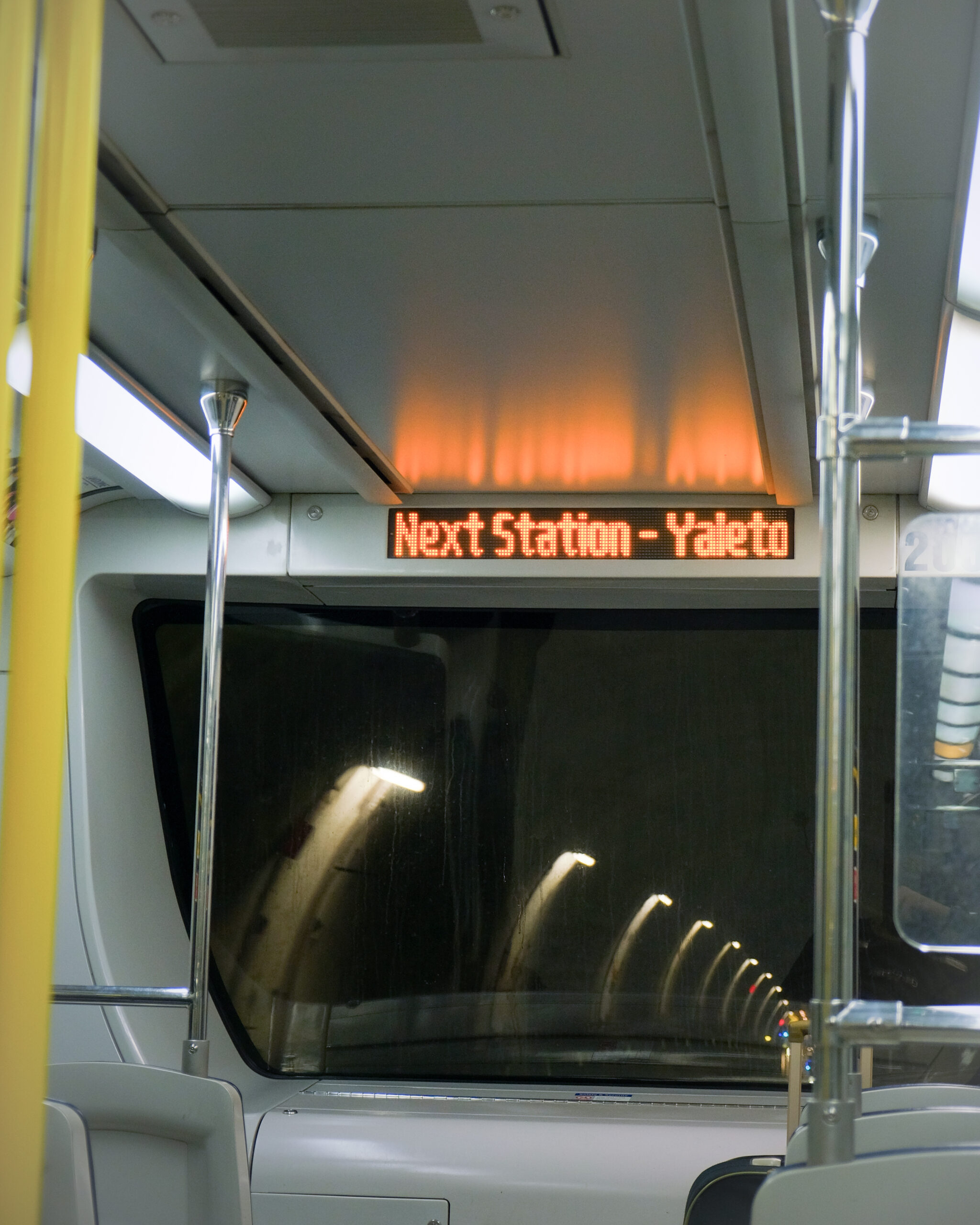
Riders mainly use the train’s banner display as the main visual indicator for information about the next station. However, the position and format of the banner display makes it difficult to glean information quickly and accurately:
Since the display is only at the ends of the cars, its difficult to see it through the crowd in peak transit hours, especially for seated or shorter riders.
The horizontal scrolling of information provides riders with a painfully slow transmission of information – increasing the chances of missing important information at key points in the ride.
Although the auditory announcements give riders another mode of information for when to get off the train, it cannot be solely relied upon because the announcements are often difficult to hear – especially during peak transit hours when there are lots of noise on the train.
Riders often peek through the train’s windows to identify a station by the environment outside or look for a sign that displays the name of the station. However, the visual monotony of the Canada Line stations makes it easy for riders to mistake one station for another. The absence of window-level signage also makes it difficult to identify each station explicitly and immediately, leaving riders to rely on in-train indicators instead.
Canada line digital display scrolling information horizontally
View from inside the Canada Line
Although this is the view to a different station, its visually indistinguishable
Previous
Next
Design recommendations
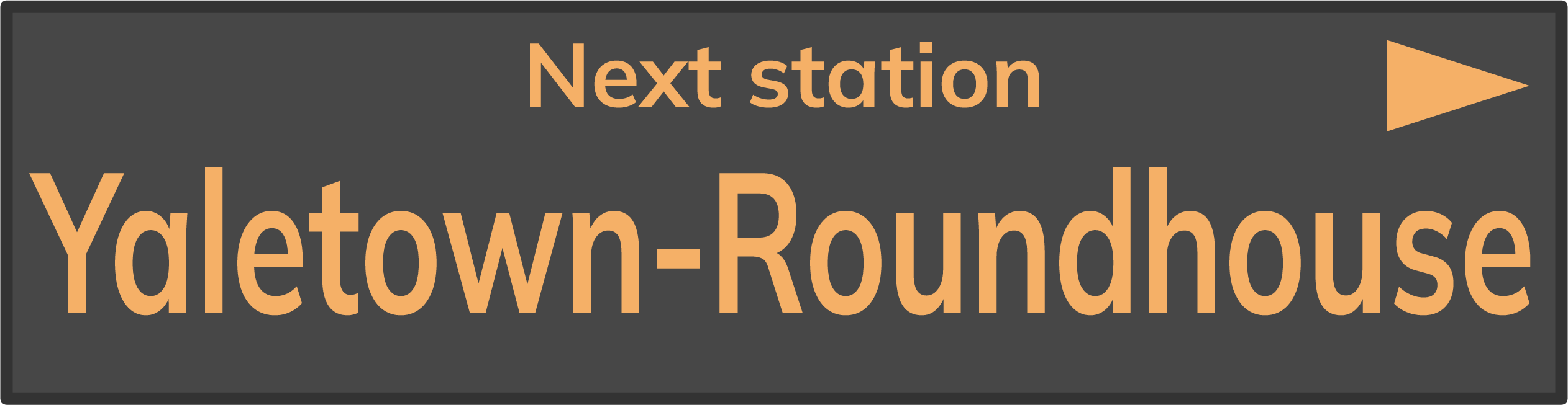
5. Re-design the in-train banner signs so that it displays vital information that is easy to digest, and corresponds with key parts of the journey.
The banner sign should:
Operate using a vertical swipe transition instead of continuously scrolling the information horizontally.
Cycle through the terminus station and the next information when the train begins to move and when it’s stopped at a station.
Display only the next station information a few seconds prior to the train stopping.
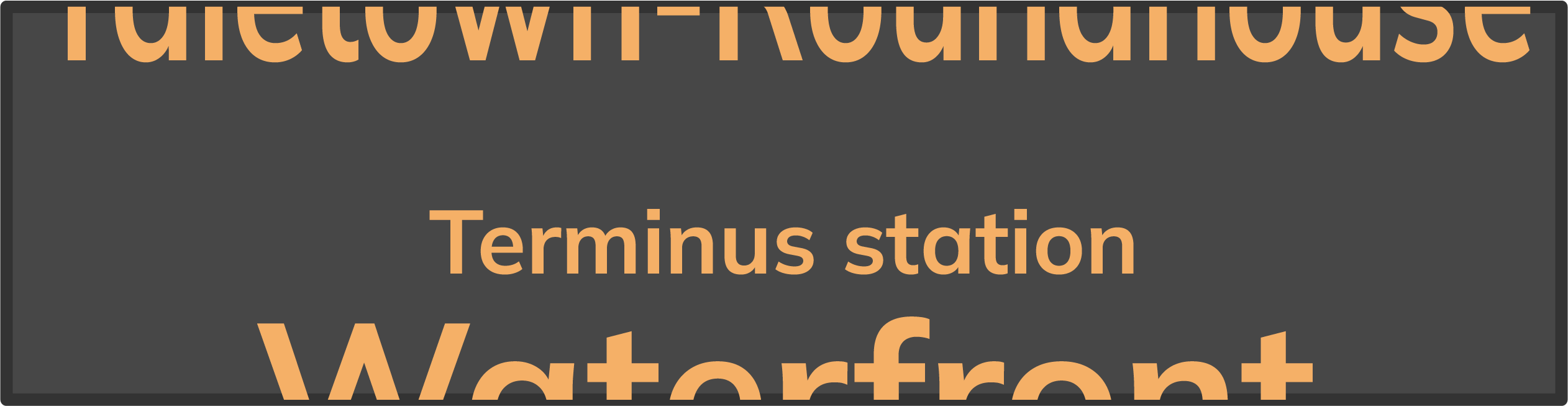
Banner display showing the terminus station. When the train is stopped and when it begins to move, it’ll swipe periodically between this screen and the next station information.
A vertical swipe transition between the terminus station and next station information
Banner display showing the next station information along with an arrow showing which door will open at the station.
6. Coordinate the in-train banner displays and audio announcements to indicate which door will open at the next station.
The banner displays can show a simple indicator that points to the door that will open, while the announcements can corroborate this by stating which side of the train passengers should go to exit (e.g., “The next station is Oakridge, the doors will open on your left“).
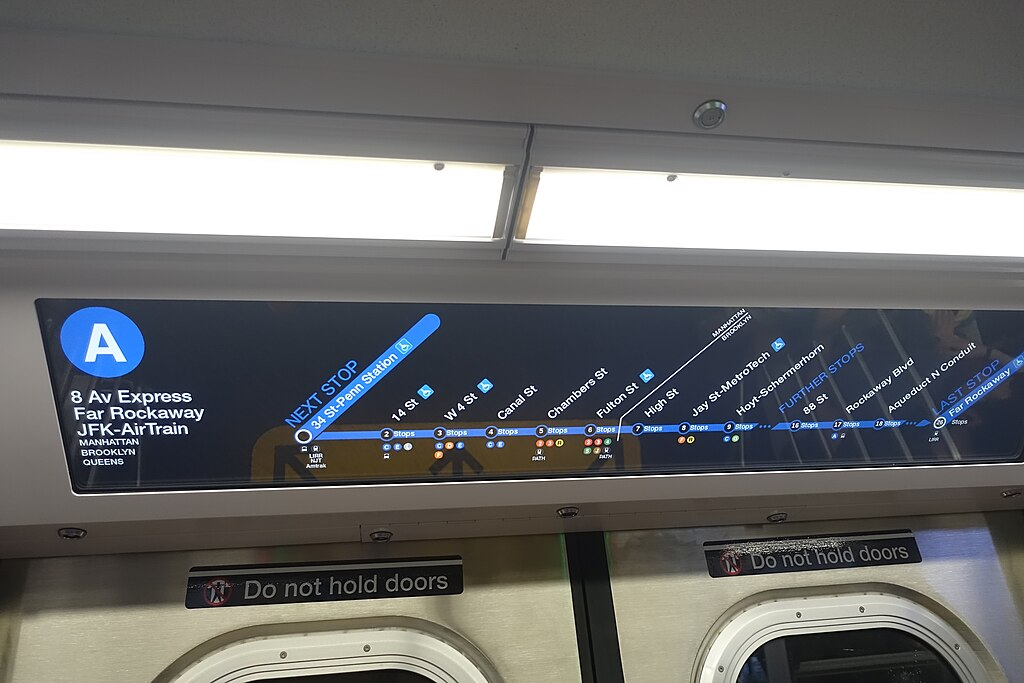
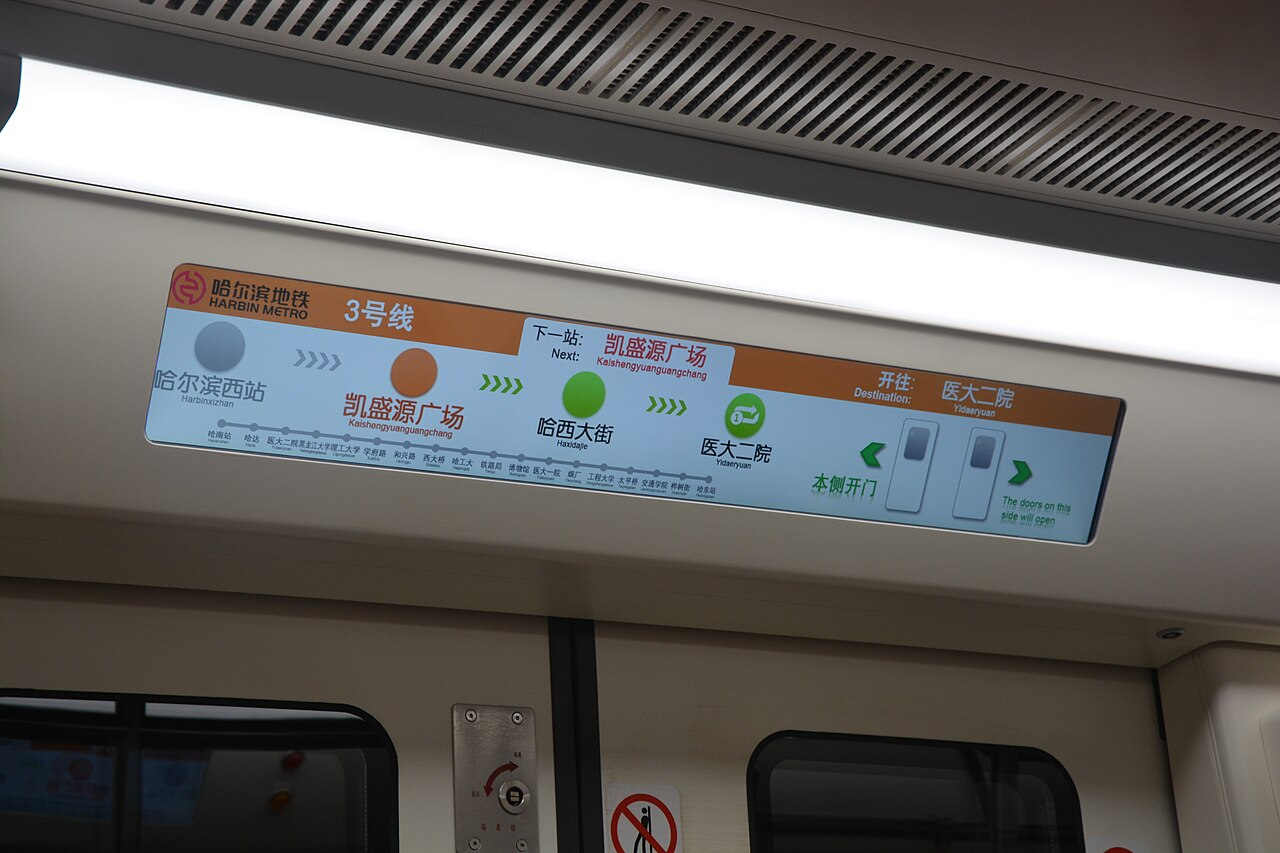
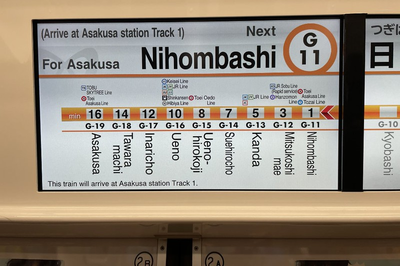
7. Install ‘active’ digital station displays above each car door to show the train’s current location and upcoming stop.
The digital displays provide riders with another way to track the train’s location relative to the stations. At minimum, it should show the current station and the next station. But, the best designs are those that give riders the full picture of their ride by also showing the terminal station, time expected between stations, as well as any transfer points for popular buses or lines.
Digital display in New York Metro showing the current station and multiple upcoming stations at the same time
Digital display in Harbin Metro showing the station that’s passed, the upcoming stations, and where the doors are opening
Tokyo subway digital display showing the next station, the upcoming stations, and the line’s number
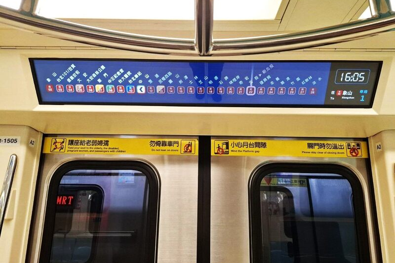
Taiwan subway digital display showing the current and upcoming stations
Impact of 5-7:
Riders are able to use multiple indicators to consistently track which station the train is currently heading towards in order to prepare their exit prior to the train stopping:
Riders have increased, perpendicular sightlines (display banners at both ends of the cars and ‘active’ map displays on top of the doors) so that information about the train’s location is always available and unambiguous.
Riders can prepare themselves at the appropriate door to exit the train, by looking at the banner display or listening to the announcements, so that exiting from the train feels less frantic.
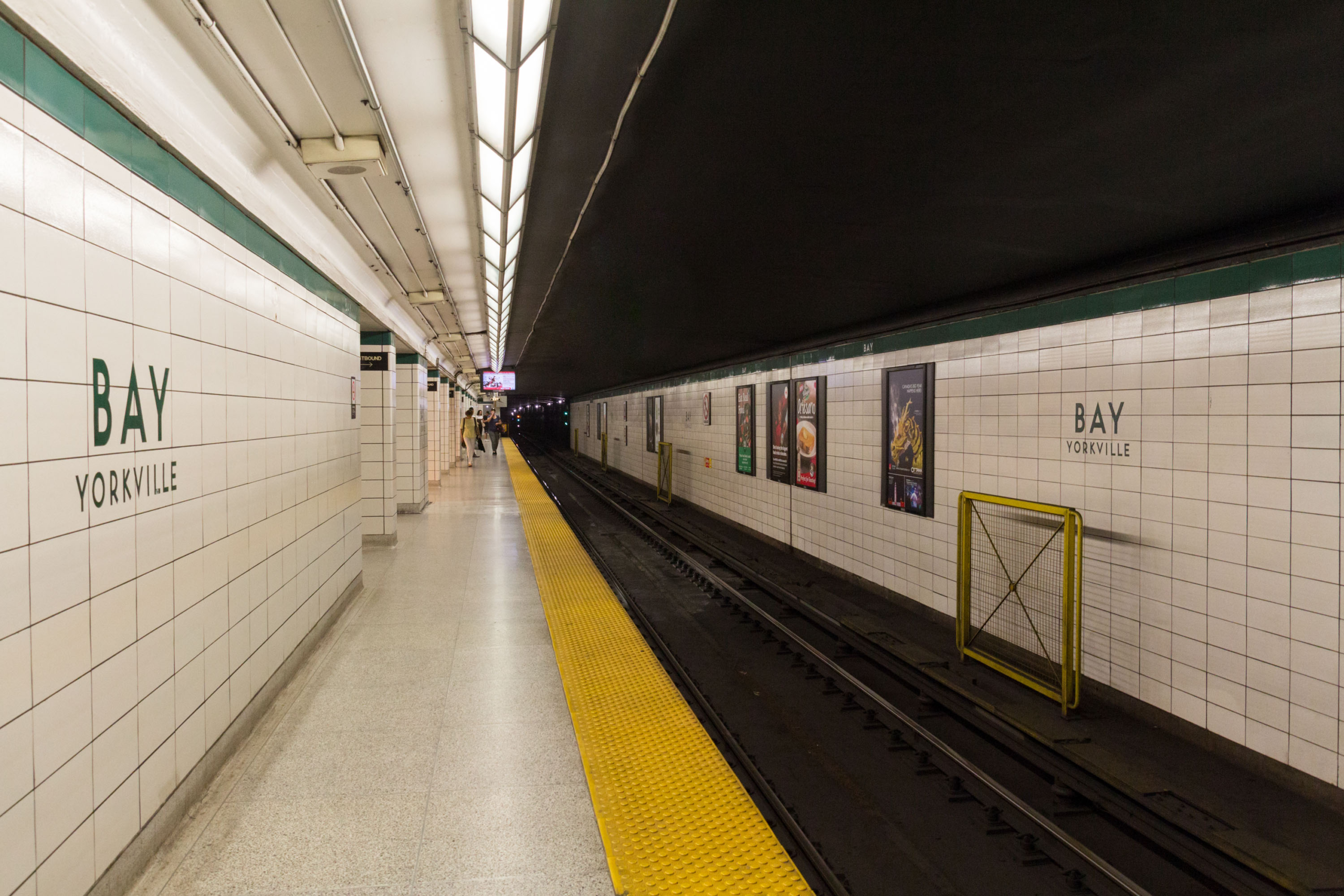
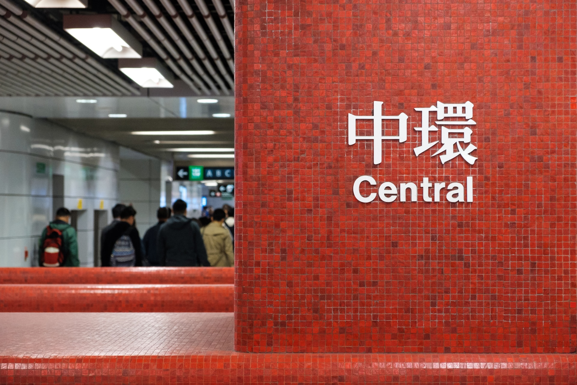
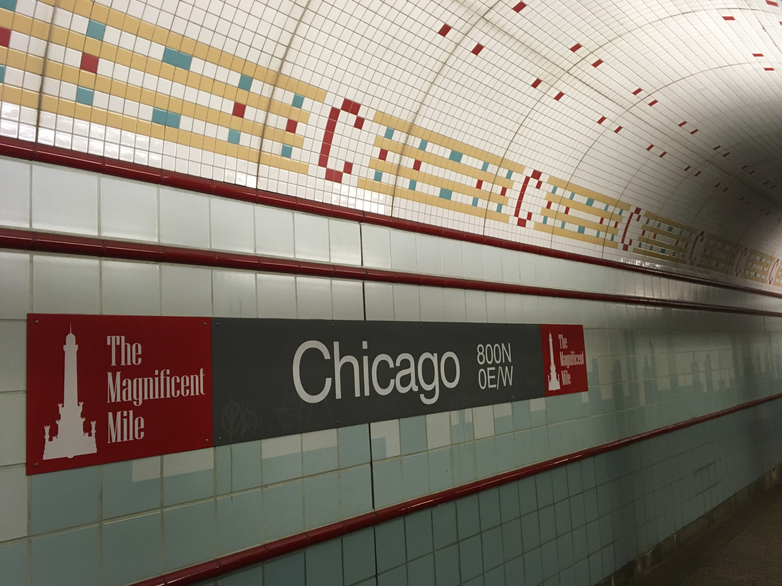
8. Increase the visual distinction between stations using colours, patterns, and distinct designs drawn from local areas.
By distinguishing each station visually from one another, riders can also begin to build a sense of connection to each area as they begin to identify with its visual uniqueness (see Toronto’s Bay station, Hong Kong’s Central station, and Chicago’s Chicago station below).
9. Install station signage so that it is visible through every train car door and window at both standing and sitting height.
Sign stations should be installed at the average person’s chest height in clear, legible fonts so that its easy to see from within the train.
9. Install station signage so that it is visible through every train car door and window at both standing and sitting height.
Sign stations should be installed at the average person’s chest height in clear, legible fonts so that its easy to see from within the train.
Bay station in Toronto using the distinctive green tile strip
Central station in Hong Kong with its iconic red tiling
Chicago station in Chicago using unique tilework along the walls that riders can see from in the train
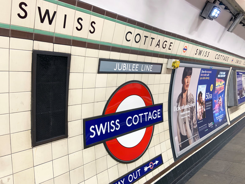
Swiss Cottage station in London using large station name signs to let riders inside the train know where they are
Impact 8 & 9:
Riders can discern which station the train is at through a brief glance outside, so that riders don’t have to rely only on in-train indicators.
Impact 8 & 9:
Riders can discern which station the train is at through a brief glance outside, so that riders don’t have to rely only on in-train indicators.
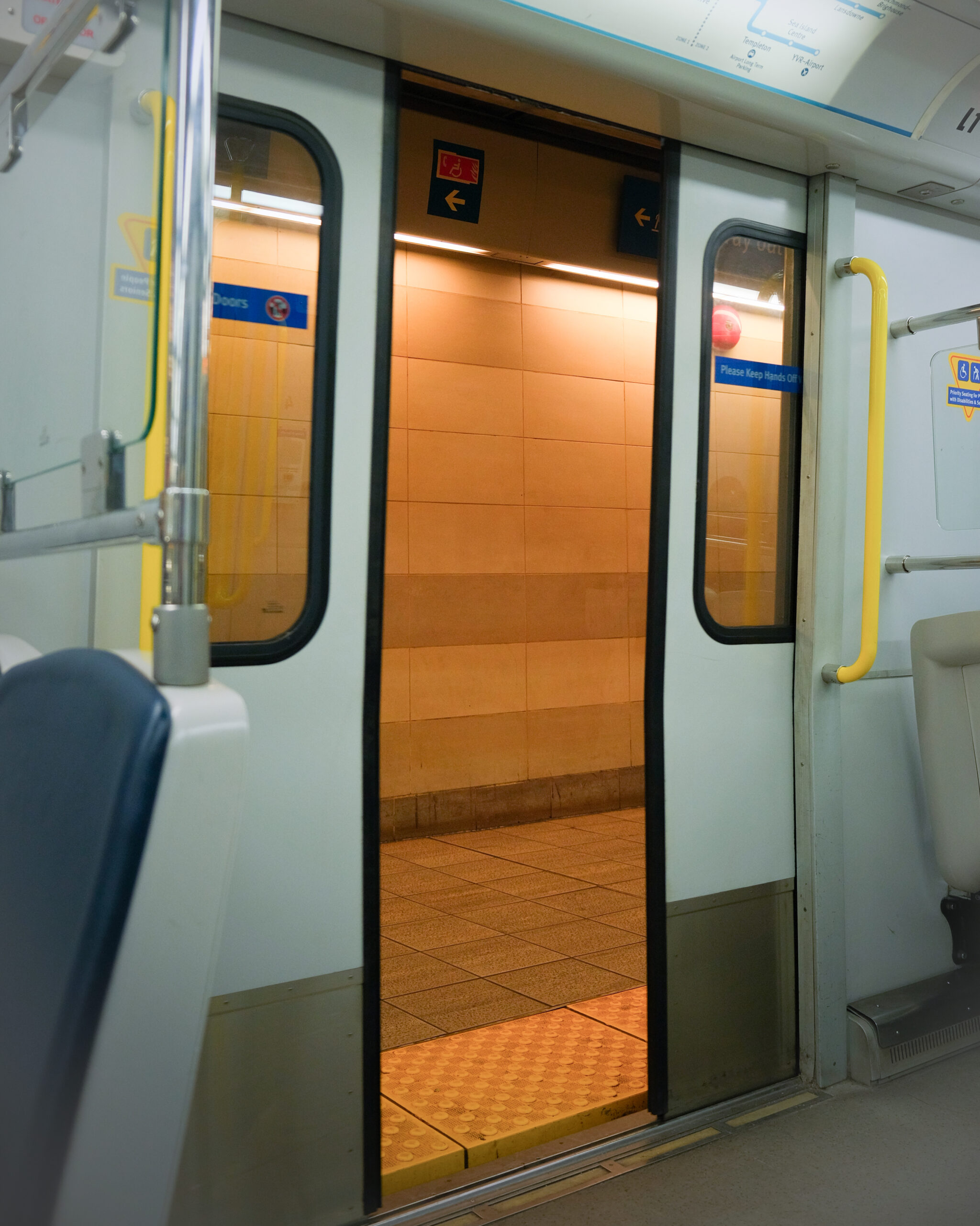
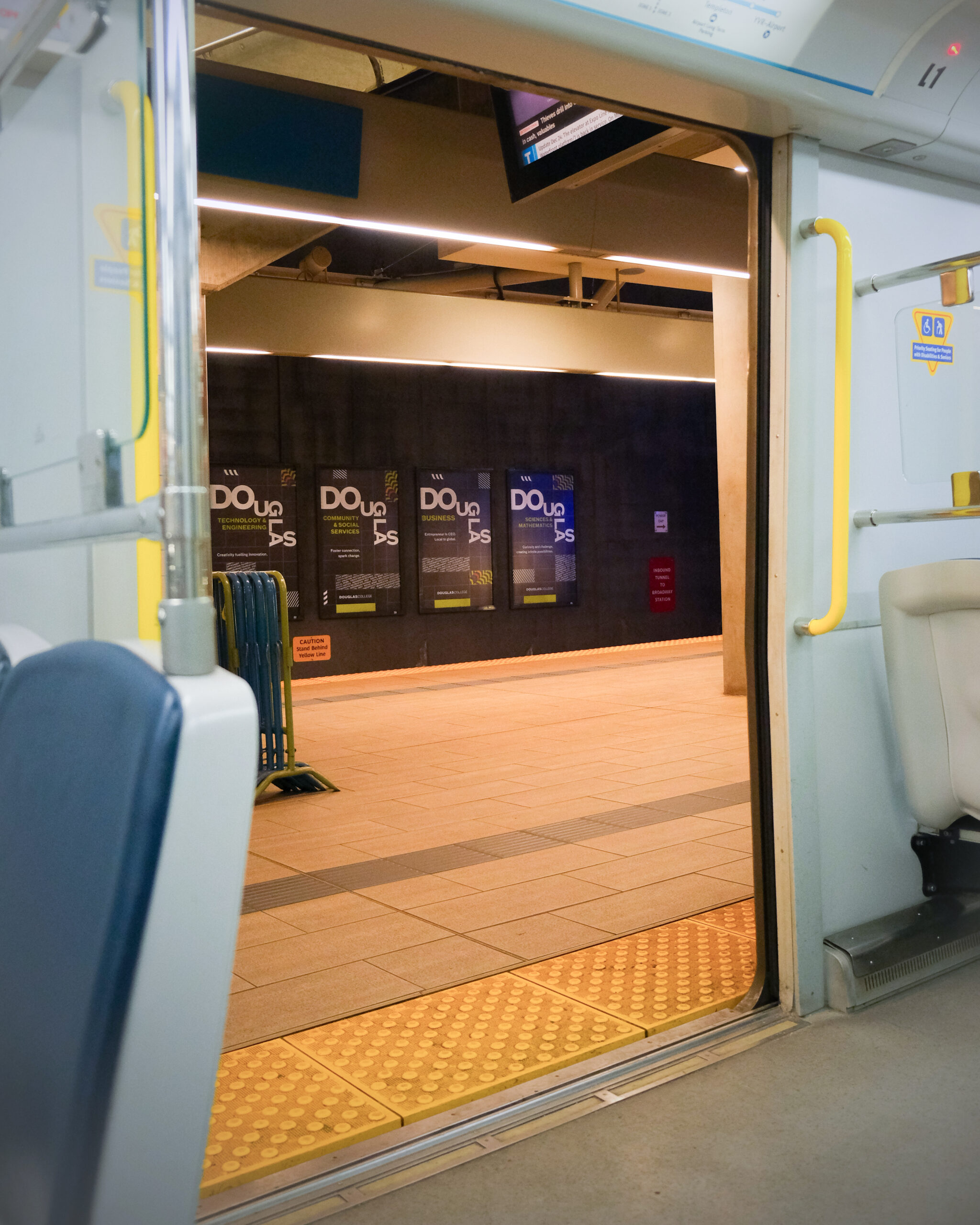
D) Exiting the station
Riders want see detailed directional signage as soon as they exit the train so that they can understand where to go right away, but…
Riders want see detailed directional signage as soon as they exit the train so that they can understand where to go right away, but…
Pain point
Instructional signage (e.g., signs that tell riders where to go) are often difficult to find and are only written in english, making it more difficult for non-native english speakers or visitors to Vancouver to understand.
Design recommendation
10. Install exit signage at the immediate sightlines of every train door so that riders can immediately follow exit directions, and ensure each sign incorporates multiple ways to read it (e.g., languages, icons)
More complicated instructions or directions should incorporate multilingual text and translations in Vancouver’s most common languages (e.g., French, Chinese, Punjabi) (3). The signs should also maximize the use of iconography and visuals so that riders are not reliant on text instructions.
10. Install exit signage at the immediate sightlines of every train door so that riders can immediately follow exit directions, and ensure each sign incorporates multiple ways to read it (e.g., languages, icons)
More complicated instructions or directions should incorporate multilingual text and translations in Vancouver’s most common languages (e.g., French, Chinese, Punjabi). The signs should also maximize the use of iconography and visuals so that riders are not reliant on text instructions.
Capstan station exit signs showing riders where to go, but its only written in english with no other visual iconography
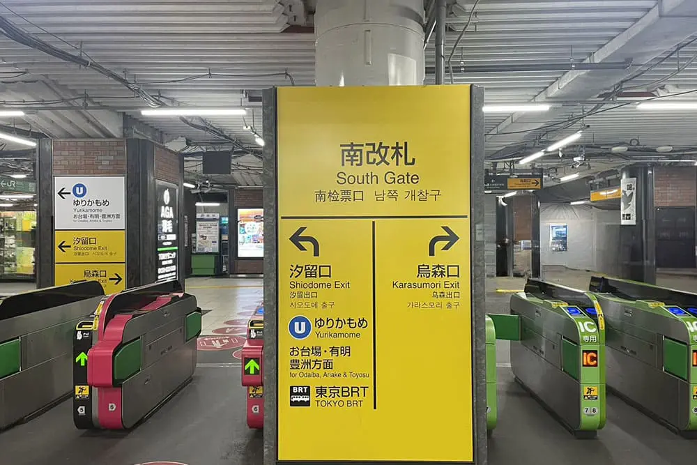
Exit sign from Tokyo’s transit system showing directions in multiple languages
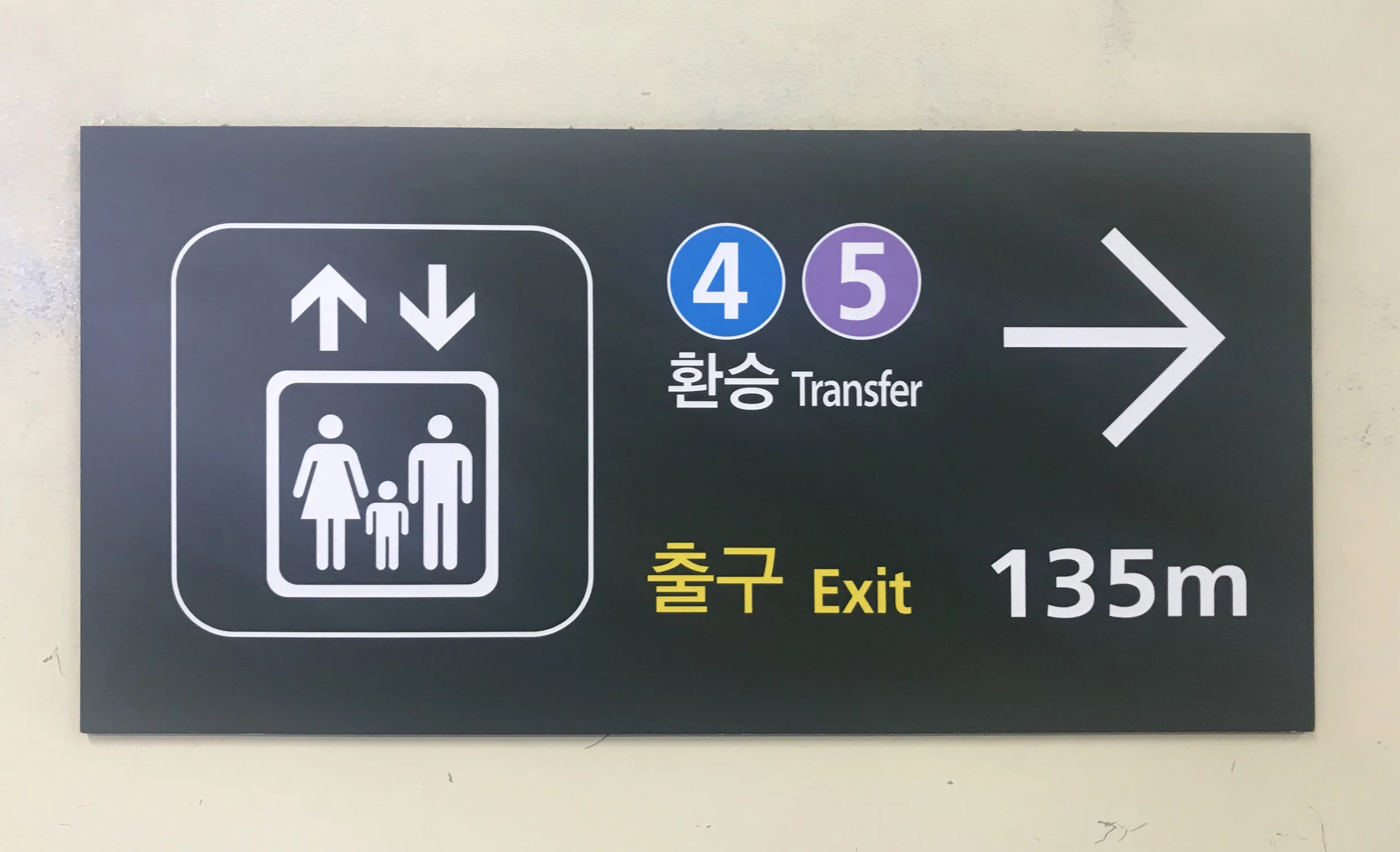
Exit sign from Seoul’s transit system showing where the elevators and other lines are, and how far they are.
Impact:
Riders are able to quickly understand and intuitively follow the signs to exit the station or transfer to another line.
Impact:
Riders are able to quickly understand and intuitively follow the signs to exit the station or transfer to another line.
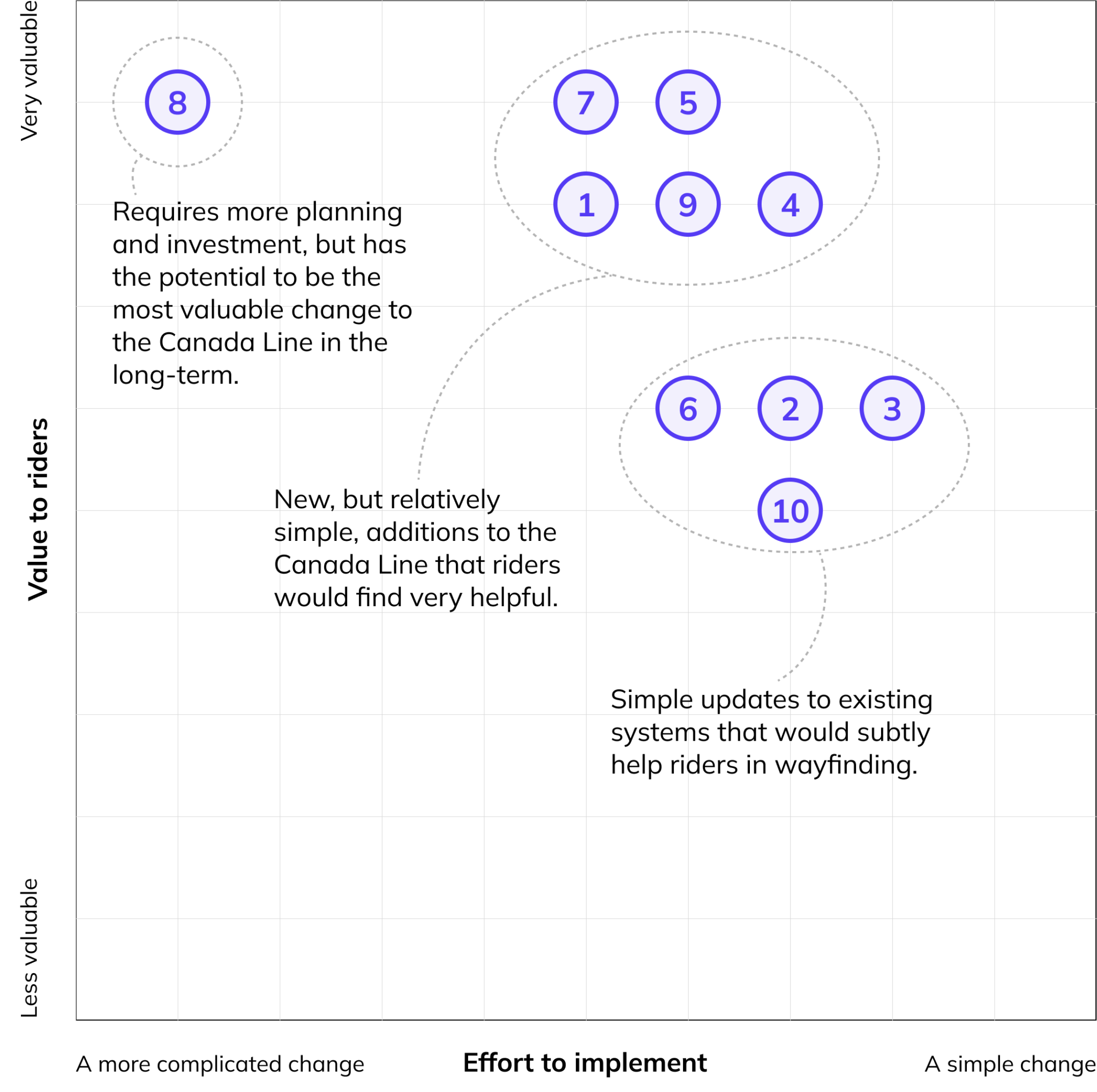
Prioritizing the recommendations
Install an information display at the entrance of every station that shows incoming riders real-time information when trains are arriving next.
Install explicit directional signage at key spots along the station’s journey lanes to consistently indicate to riders where to go to board a specific train
Correlate the audio announcements for incoming trains with a key corresponding to a platform number.
Create visual markings on the station and platform floor that will indicate key spaces and destinations to follow
Re-design the in-train banner signs so that it displays vital information that is easy to digest, and corresponds with key parts of the journey.
Coordinate the in-train banner displays and audio announcements to indicate which door will open at the next station.
Install ‘active’ digital station displays above each car door to show the train’s current location and upcoming stop.
Increase the visual distinction between stations using colours, patterns, and distinct designs drawn from local areas.
Install station signage so that it is visible through every train car door and window at both standing and sitting height.
Install exit signage at the immediate sightlines of every train door so that riders can immediately follow exit directions, and ensure each sign incorporates multiple ways to read it (e.g., languages, icons)
With a few thoughtful design changes, riders of the Canada Line can experience a transit service that's intuitive and easy to use.
The Canada Line supports about 3.57 million boardings every month in 2025 (1). Since it has started running in 2009, it has become an indispensable service for many commuters and travellers moving about Vancouver, Richmond, and the YVR airport. Yet, riders are clearly frustrated with parts of the service that don’t meet their expectations of a transit system that can be comfortably and intuitively used.
With the current construction of the Millennium line UBC extension, there is an opportunity for Translink to implement the recommendations presented in this case study in the new stations, while also updating the existing Canada Line stations. Improving the wayfinding design of the Canada Line would be an invaluable refresh to improve the way that riders experience the service, and ultimately creating a more rider-friendly transit system that can support Vancouver’s rapidly growing population.
Special thanks to my partner, family, and friends for allowing me to interview them about their experiences taking the Canada Line.
Evaluate and Analyze the Characteristics of Subway Transfer Station Facilities Based on Universal Design from the Cases of South Korea (https://www.mdpi.com/2071-1050/17/18/8374#app1-sustainability-17-08374)
Vancouver Census, 2016 (https://www12.statcan.gc.ca/census-recensement/2016/as-sa/fogs-spg/Facts-cma-eng.cfm?LANG=Eng&GK=CMA&GC=933&TOPIC=5)
Images
Any images without a citation are my photographic work or copyright-free.
Nanaimo station display (https://nanaimo-station.wheree.com/)
Guide markers in Hong Kong (https://londonreconnections.com/floors-the-next-dimension-in-safety-and-wayfinding/)
Floor signs in Montreal (https://londonreconnections.com/floors-the-next-dimension-in-safety-and-wayfinding/)
Floor signs in Toronto (https://londonreconnections.com/floors-the-next-dimension-in-safety-and-wayfinding/)
‘Active’ digital display in New York (https://nypost.com/2024/11/19/us-news/nycs-shiny-new-trains-sidelined-just-one-month-after-their-debut-and-its-not-clear-when-theyll-be-back/)
‘Active’ digital display in Tokyo (https://trulytokyo.com/navigating-japans-trains-subways-and-stations/)
‘Active’ digital display in Taiwan (https://taiwannews.com.tw/news/6129254)
Central station (Translink)
Swiss cottage station (https://www.modernism-in-metroland.co.uk/swiss-cottage-station.html)
Tokyo exit sign (https://www.tensho-office.com/en/blog/shimbashi-annex-ac/)
Seoul exit sign (https://www.projectsubwaynyc.com/blog/2018/5/7/learning-from-seoul)
Research was conducted in December 2025 and this case study was written in January 2026